Lomond Cyber — Brand Identity & Website
Branding, Brand Guidelines, Web Design

The Brief
Lomond Cyber is a new cybersecurity company focused on helping families navigate the growing complexity of online threats. They came to me at the very beginning — no brand, no identity, just a clear sense of purpose and a need to communicate it credibly. The challenge was to build something that felt professional and authoritative without being cold or corporate. Cybersecurity for families needed to feel approachable, not alarming.
The Approach
Before any design work began, I spent time with the client working through what the business needed to project and who it was speaking to. The positioning that emerged was: expert but human. Established but not intimidating. That became the foundation everything was built on.
The Logo
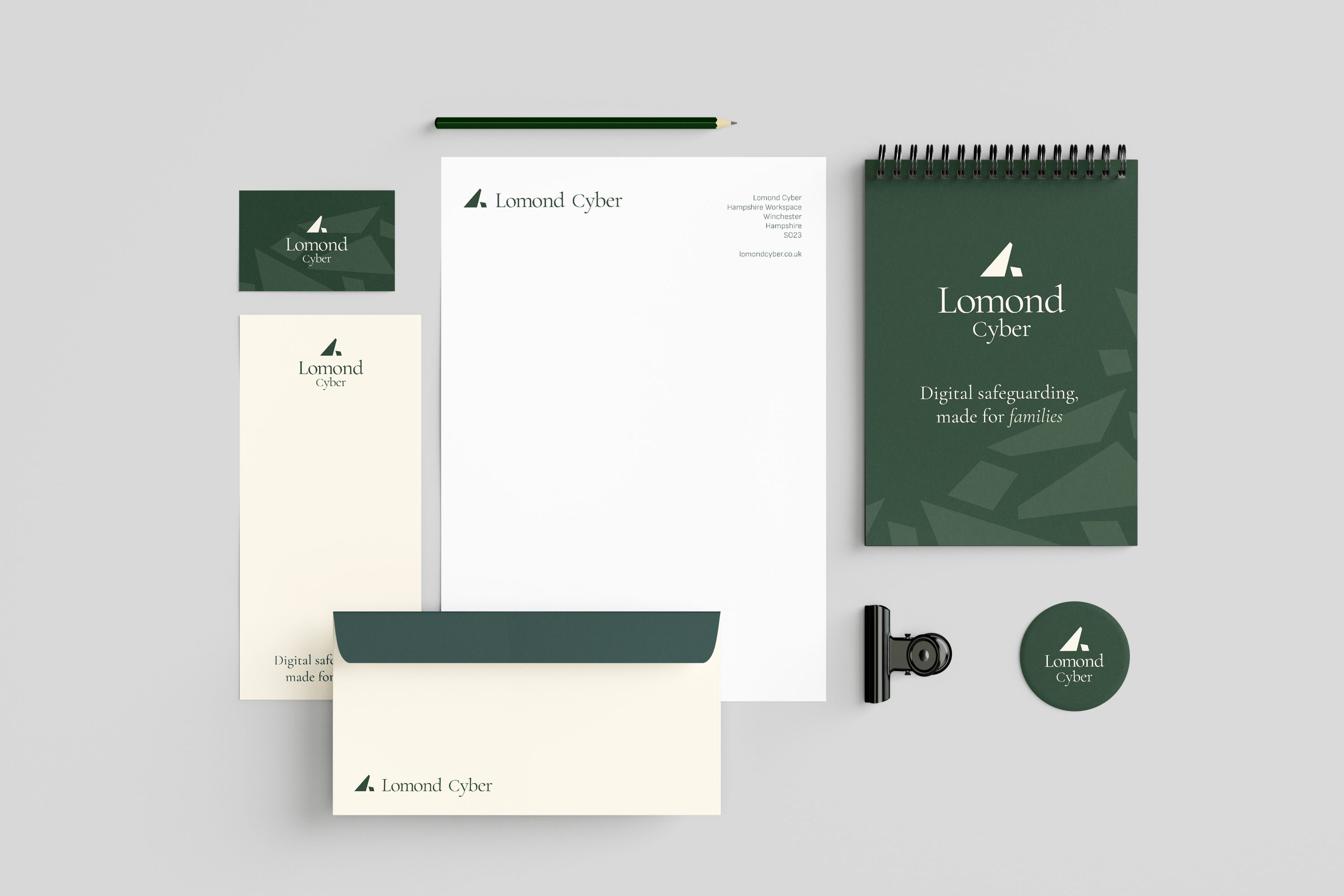
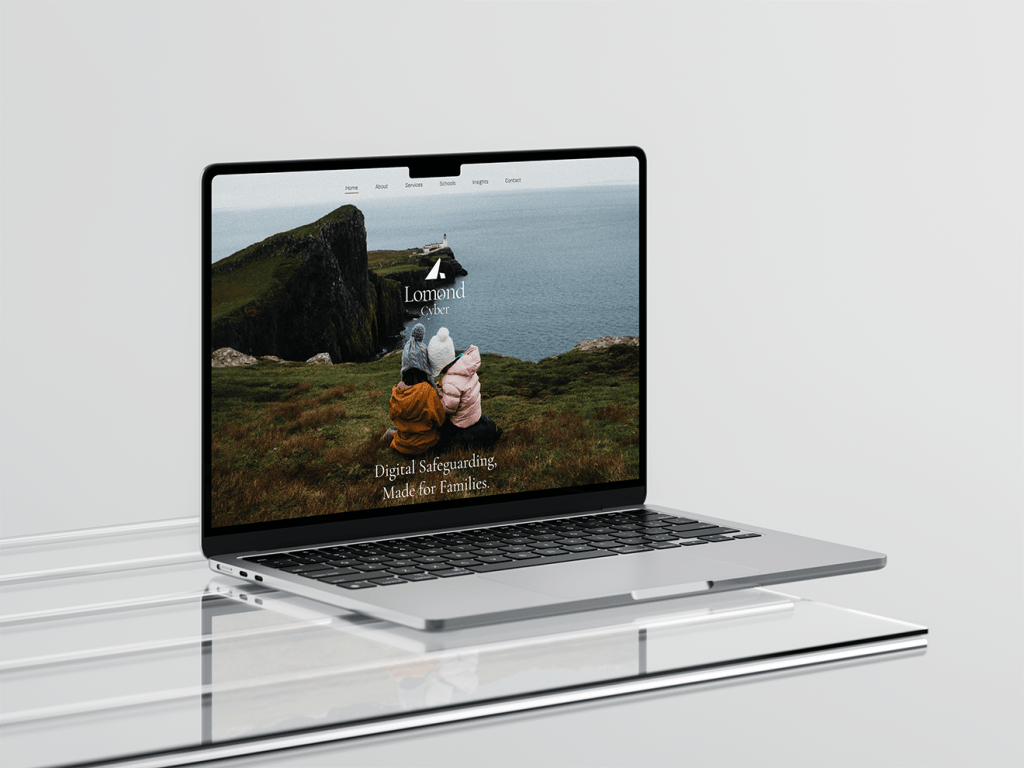
The Lomond Cyber icon is rooted in the meaning of the name itself — Lomond means beacon. The mark visualises a beam of light cutting through uncertainty, formed alongside a geometric shape that creates an abstract L. The same form subtly echoes a mountain landscape, grounding the identity in the brand’s Scottish heritage and giving it a sense of origin and quiet strength.
Typography
Cormorant Garamond was chosen as the primary typeface. A serif with classical roots and modern refinement, its high contrast and elegant proportions communicate heritage and trust — qualities that make a new business feel credible and established. Sofia Sans works alongside it as a contemporary counterpoint: clean, confident, and approachable, it stops the brand from feeling too formal and adds personality without undermining the sophistication of the overall system.
Colour & Photography
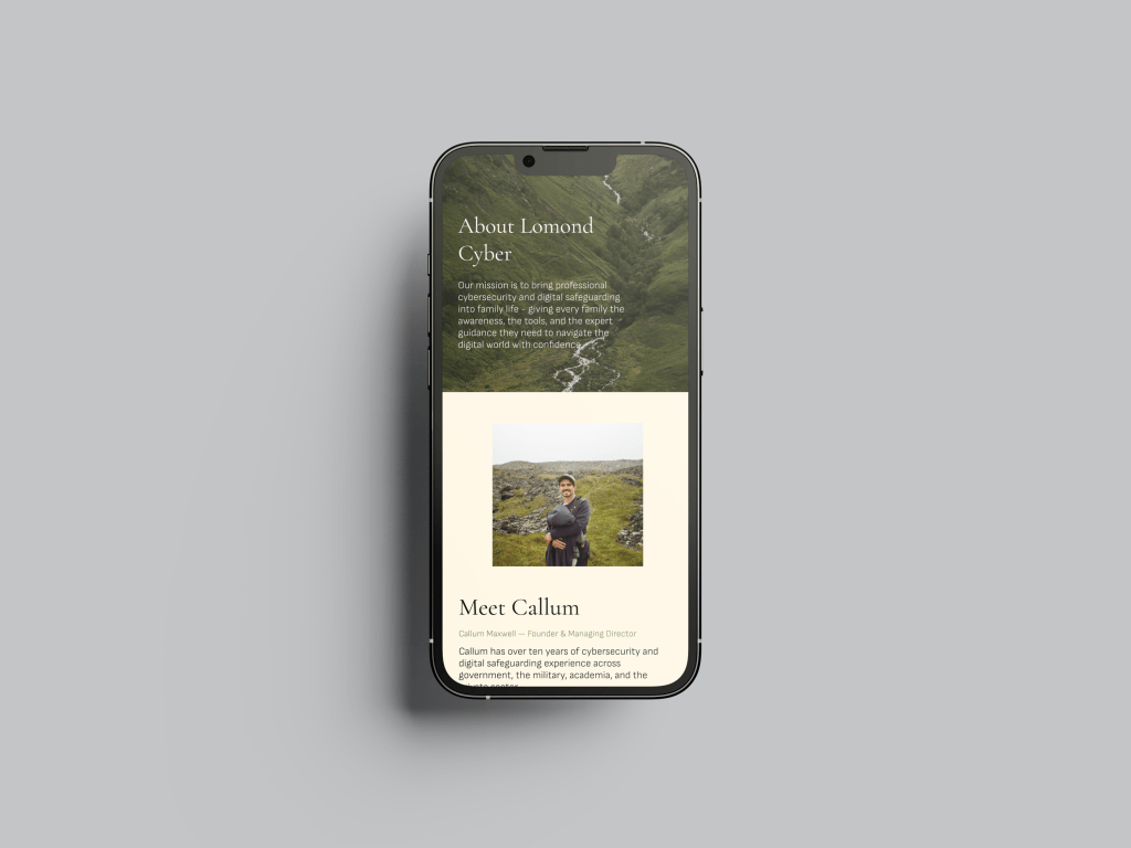
The colour palette draws directly from the landscapes of Scotland and Hampshire — muted, natural, grounded. The photography direction follows the same logic: real, slightly moody, never glossy or obviously staged. The aesthetic leans towards calm and authentic rather than polished and corporate. Realism over perfection.
The Outcome
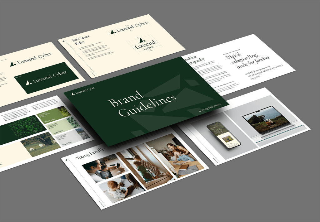
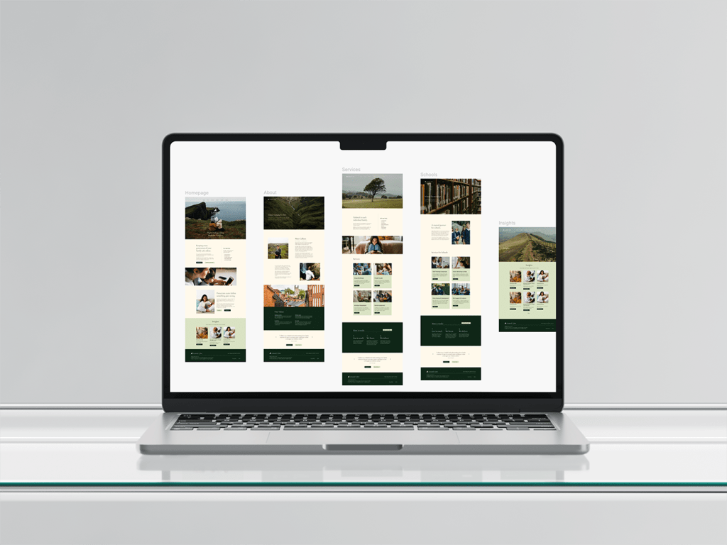
The project delivered a full brand identity, a comprehensive brand guidelines document, and a website that brought the system to life. Every element — from the mark to the type to the image style — works together to position Lomond Cyber as a business that genuinely knows its field, and that families can trust with something that matters.
