Lecture and resource reflections
Stuart Tolley and Colophon Foundry
Colophon foundry is a type foundry based in London with an outpost in LA. They believe this helps them to gain greater understanding of the American market and culture, making it more successful for them who working on projects in the US.

There are important changes in perception of words and language that change from country to country (and also even within each country) so when designing type for that location is it important to be aware of these.
They talked about the two kinds of fonts they create. Custom fonts for brands and general fonts for purchase. They both need a very different approach. Font for purchase need to be usable by many different people and in many different ways, versatility and usability is the key. When designing for a brand however you need to get to know that brands particular needs and how they use type in their business.
When creating a custom font that was intrinsically welsh for the welsh government they needed to obtain help from a local company to ensure they kept to the cultural significance of the area.
Thinking about how it will be used – Welsh is always paired with English so that must be taken into consideration.
They researched the Gaelic and Celtic medieval typefaces that were integral to welsh history and worked to see how they could make this relevant to a contemporary audience. They directed what made the fonts look welsh, looking closely at the shapes of letters and how they interacted.
They researched the language with the help of a professor of linguistics.

They incorporated the joined together letterforms from medieval welsh but with a modern feel. They added a slight kink in the uprights to add subtle interest.
Typography like this that needs to be versatile and readable as a priority so the nod to tradition needs to be subtle. It needs to subconsciously evoke an identity and sense of place but not be overwhelming.
Appropriate research into history and culture are needed for a project that portrays a national identity.
Within British Airways redesign they commissioned a range of artist from the country’s the airline flies to to create artwork for the planes tail fin. At the time it was revolutionary and didn’t go down well, but now is a great way of making a brand seem authentic.
It is difficult to design for a brand that has a strong national identity but also needs to be relevant globally. Another example of this is the Olympics.
99% Invisible (99% Invisible 2017)
Lance Wyman did the logo design for the 1968 Mexico Olympics. He needed to show the identity of Mexico but also make it welcoming and accessible for global visitors
He started off by learning about the country through the museums, combining the traditional Mexican folk art he found with the contemporary optical art movement of the time.
He also used traditional local art methods to recreate the logo, bringing the city into his design.

This type design was expanded into a system that branded the entire city for the Olympics. To overcome the issue of multiple languages, Wyman relied heavily on simple graphics and colours to show people where to go. This system was so successful it was spread to help visitors navigate the entire sprawling city. Removing words, the system was simple and universally understood.
Student protestors also jumped on to the branding, using it in protest against the government and edited the designs to show the darker side of the city.
This design set a precedent on how governments would use design to promote their city.
Ryman Eco Font (Grey London 2014)
“The best typefaces are a marriage of being very functional and very beautiful.”
(Grey London 2014)
Ryman’s font is designed to use 33% less ink and therefore reduce the amount of packaging needed. It is a small step towards making a positive impact on the planet.
With the rise of eco anxiety and sustainability, will this be an important consideration going forwards? What other ways can a font be made more sustainable or be made to ensure its impact is more positive than negative?
The ideas of location identity mentioned in Creative Review (Creative Review 2018) were interesting. They discussed how everything about a country can’t be distilled into one thing, but embracing a locations stereotype or cliche can be important as long as you are showing it in a new way, or using it in a way that works for you.
You need to think about the type of people you want to bring to your location and look closely at what makes the location special.
When looking to expand the overcrowded and over touristed city of Paris into the neglected surrounding suburbs Rémi Babinet wanted to work with the neighbourhoods to reestablish them, but without destroying what made them unique. It is interesting to think how design can play an internal role in making the future of a city and the importance of looking at projects like this from a design perspective early on.
This creates ideas such as how to make cities more accessible to an ageing population. Maybe going forwards we will need to design cities with pandemics in mind. Covid has made it very obvious that our cities don’t work well in situations like this. We need wider pavements, touch free traffic lights and shop doors and more open air seating.
Workshop Challenge
Lettering analysis of my collections and others found
In light of my research around creating letterforms that show identity I believe I need to research the history and culture of the location, as well as noticing its contemporary identity.
Think about how my letterforms will be used – do they need to be simple and readable or can they be more abstract. Who am I making them for?
I want my lettering to evoke a sense of place and identity but not be overwhelming.
I like the idea of creating something that can be reproduced in different ways like the Mexico Olympics logo. I think this also allows more of the specifics of the cities identity to be displayed without making the design overwhelming.
I researched the history of Bristol.
“In the early 11th century there was a mint in Bristol so it was already a place of some importance. There would have been a weekly market in Bristol. Because of its position in the West Bristol was well placed to trade with Dublin, Somerset and North Devon. Wool and leather were exported. Bristol boomed in the late 17th century as new colonies were founded in the West Indies and North America. Bristol was well placed to trade with them because of its position in the West. Tobacco was imported from North America and sugar from the West Indies.
In the 18th century Bristol was heavily involved in the slave trade. Manufactured goods from Bristol such as woollen cloth and brass and iron goods were given to the Africans in return for slaves. The slaves were then transported to the West Indies of North America and sold. The ships then took tobacco, sugar and rum back to Bristol. So the trade formed a triangle. Also in the 18th century timber was imported into Bristol from Scandinavia, mainly for shipbuilding. Glass and shipbuilding thrived in Georgian Bristol. So did a chocolate industry and brewing
In the 20th century aircraft manufacture became the greatest industry in Bristol. Other industries in Bristol were chocolate, tobacco, engineering, chemicals, zinc, furniture, and pottery. Moreover, Bristol continued to be an important port in the 20th century. During the Second World War 1,299 people in Bristol were killed by German bombing. About 3,000 buildings were destroyed and 90,000 were damaged.” (Lambert 2021)
The importance of the city as a trade port is very integral to its history, and this is inherently linked to the slave trade, something that has been pushed up to contemporary importance once again recently with the toppling of the statue of Colston and renaming of many buildings in Bristol to remove his name. I want to reference Bristols late 17th C importance and part it played in the slave trade but only subtly to show the cities contemporary identity, where it is facing up to it’s past but forging a positive, vibrant and inclusive future.
To start I looked closely at examples of type I had collected, focussing on the shapes of the letters and how they interact with each other, while thinking about what feelings they created in me. I sketched particular letters that jumped out to me and tried to recreate the letterforms in the letters that made up BRISTOL.

The traditional letterforms contained prominent serifs which made them seem quite serious and important. A lot of these letterforms were also all capitals and with one characteristic such as a swirl in this Q that add a point of elegance and interest. These letterforms make me imagine the time when Bristol was booming as a trade port and centre for industry, and the wealth that came along with that.

The industrial letterforms themselves however that after still left have a very different form, they are simple, capitalised sans serif lettering thats only real purpose is to inform and easily and quickly as possible.


Alongside these two kind of lettering, there are also many artistic letterforms around Bristol. From swirling calligraphy fonts, to letterforms that are pushed so far towards abstraction that they are almost just shapes such as the sign for the Arnolfini Art Gallery.

I want to find a way to incorporate all of these sides of Bristol and the letterforms that represent that, but in a unified way.


I tried writing the letters in different formats from, pencil to coloured markers. Before transferring them to my computer to see how the digital forms looked.
In the idea at the top, I turned the traditional serifs into triangles to create a modern twist on their traditional forms.

The different styles of type I was trying to bring together looked at bit at odds with itself and the font didn’t flow as I wanted. After a tutorial session, I went back to paper and sketched out some more letterforms.


I decided on a capitalised font to draw into the use of capitals I found around Bristol. The pile of colourful paper I was using to sketch my ideas sparked an idea in me of the importance of colour in this font to show the vibrancy and diversity of Bristol.

I came across this font inspired by the iconic LGBTQ+ rainbow flag to honour the memory of the flags designer Gilbert Baker. The simple shapes, bright colours and clear message of acceptance and diversity is something that I think fits well alongside the identity of Bristol. (McCauley 2017)

Using the paper itself I cut up the letters of Bristol to arrange them in a fun way full of movement. I put this on the computer and animated it into a short moving film. I think it summed up the artistic, bold side of Bristol but had lost the historical aspect.


I drew a stencil inspired font, made of simple shapes with the inclusion of triangles as before to represent the serifs. Played around to get the ratio and weight right, then cut it out. Underneath my cut out there happened to be a few more sheets of coloured paper. I was immediately drawn to the colours and layers of this so I moved them around to create crisp colourful layers poking through the font.
I digitalised this look to make it crisp and bold, and adding black to make the colours pop. I also made a small animation of the lettering to add to the identity of Bristol as full of movement.
Final outcome
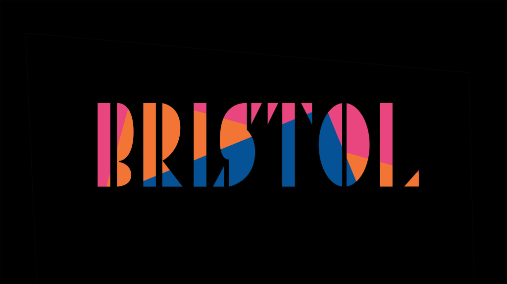
My final outcome incorporates the clear capital lettering of the industrial fonts, traditional serif fonts and bold modern lettering that is almost no longer letters at all. Together they represent the varied identity of Bristol as a city steeped in history but carving a bold, colourful and artistic future for itself. While the overlapping colours hint towards the diverse and accepting culture within the, at times harsh looking, city.
I imagine my lettering as a marketing campaign for Bristol, with this font as the main one, with versions that differentiate each area of the city from the next. This way the differences and unique parts of Bristol are celebrated but shown as part of the complex and intertwined identity of the city. I think the use of colour and shape could also be used across other material to become a branding for the city and be used on posters.


Reflection
These two weeks have instilled in me a greater understanding and appreciation for the letterforms that are always around us. Taking the time to linger on them and look a little deeper always ends up being rewarding in some unexpected way. Letterforms evoke a sense of identity and place with the viewer that is often subconscious, and possibly when this is subconscious is when you know the letterforms have been most successful.
In trying to represent the identity of Bristol through lettering, I have researched the cities past and explored its contemporary identity. My lettering draws inspiration from the past but is very much sat in the present day, using bold shapes and bright colours to grab the viewers attention and immediately show them how artistic, creative, vibrant and diverse Bristol is as a city.
Inspired by Colophon Foundry’s idea that” typography needs to be versatile and readable as a priority so the nod to tradition needs to be subtle. It needs to subconsciously evoke an identity and sense of place but not be overwhelming.” I wanted to push the letterforms to become a bit abstracted and made using simple shapes, but ensure the text was still readable so the font could have a commercial use in advertising the city.
If I had more time I would like to take this idea further and use the branding to identify the unique but unified nature of the different areas of Bristol, adding in the name of each area in stencil font below the lettering and a simple symbol representing that area, created in the same style.
Reference list
99% INVISIBLE. 2017. “Mexico 68.” 99% Invisible [online]. Available at: https://99percentinvisible.org/episode/mexico-68/ [accessed 4 Feb 2021].
CREATIVE REVIEW. 2018. “The CR Podcast Episode 14: Making, Changing and Documenting Places.” Creative Review [online]. Available at: https://www.creativereview.co.uk/the-cr-podcast-episode-14-making-changing-and-documenting-places/ [accessed 4 Feb 2021].
GREY LONDON. 2014. “THE RYMAN ECO ALPHABET POSTER PROJECT.” Ryman Eco [online]. Available at: https://rymaneco.co.uk/about.html [accessed 4 Feb 2021].
LAMBERT, Tim. 2021. “A History of Bristol.” http://www.localhistories.org [online]. Available at: http://www.localhistories.org/bristol.html [accessed 4 Feb 2021].
MCCAULEY, Jim. 2017. “Rainbow Flag Designer Commemorated with Free Font Family.” Creative Bloq [online]. Available at: https://www.creativebloq.com/news/rainbow-flag-designer-commemorated-with-free-font-family [accessed 4 Feb 2021].

Leave a comment