Lecture Notes
Please describe a case study when innovative design thinking and fresh insight enabled a surprising project outcome.
Torsten Posselt – Forced to change direction as the client doesn’t like a project. Its a failure of sorts. But makes you rethink and move stuff around. Failure helps you to start from scratch. Trying to do things differently and to control technology in the way you want to. If you think something is a bad idea- fight against it and make a case against it.
Matthew Jones– Took ride data from cyclists and added it to a pattern design. 21 stages of tour de France. They allowed people to discover the story of the pattern, instead of shouting about it. So people spread it themselves. Depth and hidden messages – makes people fall in love with the work.
Wouter Dirks – Logo for university wanted a distinguishing mark. Created a universe of elements like chemical elements to map out the university to focus on what makes university special.
Stijn van de Ven– How to build a brand for contact lenses. Had to change conversation around the product- approach people who are unsure about lenses. Taking brand values and making them real within what they do.
Luke Veerman – People getting on trains at the same place making some carriages too full. Can you design an app for this? Research and speaking with people who are using the train. Interview and observe. Realise an app isn’t going to help so came up with other solutions. Big LED screens along the train station to see where the doors will be and how crowded in this part of train, where for bike and wheelchair etc. What you end up delivering is totally different to what the client wants because you researched and really looked at what the problem is. On the customer side so want to make something that will work and help people. Need to back this up with research then you have a good chance of succeeding.
Lecture Reflection
It seem that often the first solution you work towards or the solution a client wants you to create isn’t always the best thing to create.
Torsten Posselt for example mentioned that when a client doesn’t like a project you’ve created it can be hard, but this failure forces you to re-evaluate and think about the project in a new light.
I think Matthew jones project with Rapha is very interesting as the subtleties and consumer led exploration that uncovers and spreads the message of the work is really interesting.
Many of the designers talk about having to reframe the problem given by a client to make sure they are looking from the customers perspective and really creating something that helps them. This needs research and bold thinking, but as Luke Veerman says, when it’s carefully considered and back up with research it is important to push for the solution that benefits the consumer rather than just the client.
Reading Notes
AWWWARDS –
- Fantasies to create by merging technology and art. How to make experiences that people have not had before, to give technology a personality.
- Creating pods that are sensorial – smells etc that can be controlled for health benefits.
- Creating synthetic nature for places where you can’t access real nature. Feel the connection and benefits of nature when you can’t get there. Created a half real half VR immersive experience. (AWWWARDS 2018)
Joel Beckerman
- Music and sounds guides our lives, memories and emotions. We respond to sound quicker than any other sense.
- Designing from humans at the centre has never been more important now. Most designers forget about sounds, but what’s more human than sound?
- Changing sounds can completely redesign your experience of something. You believe your ears before your eyes. Split second reactions can only be triggered by our ears.
- We live in a very visual world. Often don’t understand the role of sound until its gone. (99U 2019)
Glug
- Being creative is about being invincible and naive at once.
- Building tools for musical creativity. Using machine learning to create art.
- Try to encapsulate their ideas in a line – ie. doodle to find works of art (Glug 2019)
Reading notes

I think the draw to search idea is really interesting and a great way to get people involved and connected to the art they find. Having to do something physical to find pieces gives the user more of an emotional connection to what they find, as they have worked for and, in a way, chosen this art.
Micheal Beirut believes that a logo isn’t always the most important part. Creating a solid visual language that permeates through everything can be more powerful and seem less like you are simply trying to sell something.
“The most important characteristic for a great brand is consistency. This is different from sameness.”
(Bierut 2015)
I also like his idea that, “Your best chance to grow is to do something you don’t know how to do.” Being relatively new to graphic design I find a lot of things are things I don’t know how to do, but instead of ignoring them and being afraid of them, the best thing to do is dot hem anyway and not be afraid to fail. Coming at something with a completely new and maybe even naive perspective can create some interesting outcomes. (Bierut 2015)
“I design best when I’m interested in the subject matter. As a result I’ve learnt to be interested in as many things as possible.” (Bierut 2015) Design can open you up to so many different other industries, which I think is a really exciting part of it.
Micheal Beirut also believe that graphic design needs to hit a hard balance of being new and different, but not too new or different. This is a sentiment I’ve come across from other graphic designers and is a hard balance to achieve, but when done successfully it creates brilliant work and is always something to strive for.
Development
When speaking to people about my potential ideas, I found that most people were drawn to the ideas of creating a user focused website or creating a universal symbol. When discussed with people further however, most seemed to agree that the website would offer a more useful solution to the problem I am trying to solve.
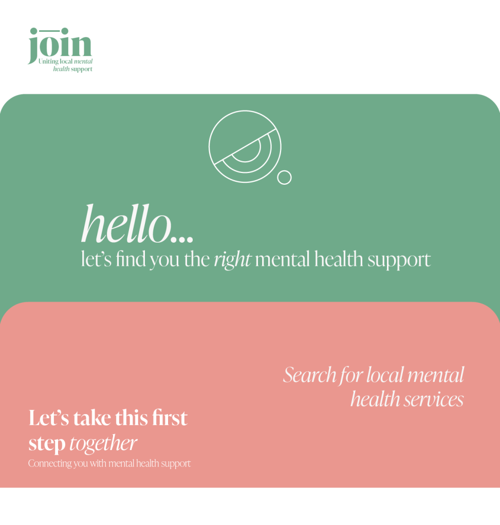
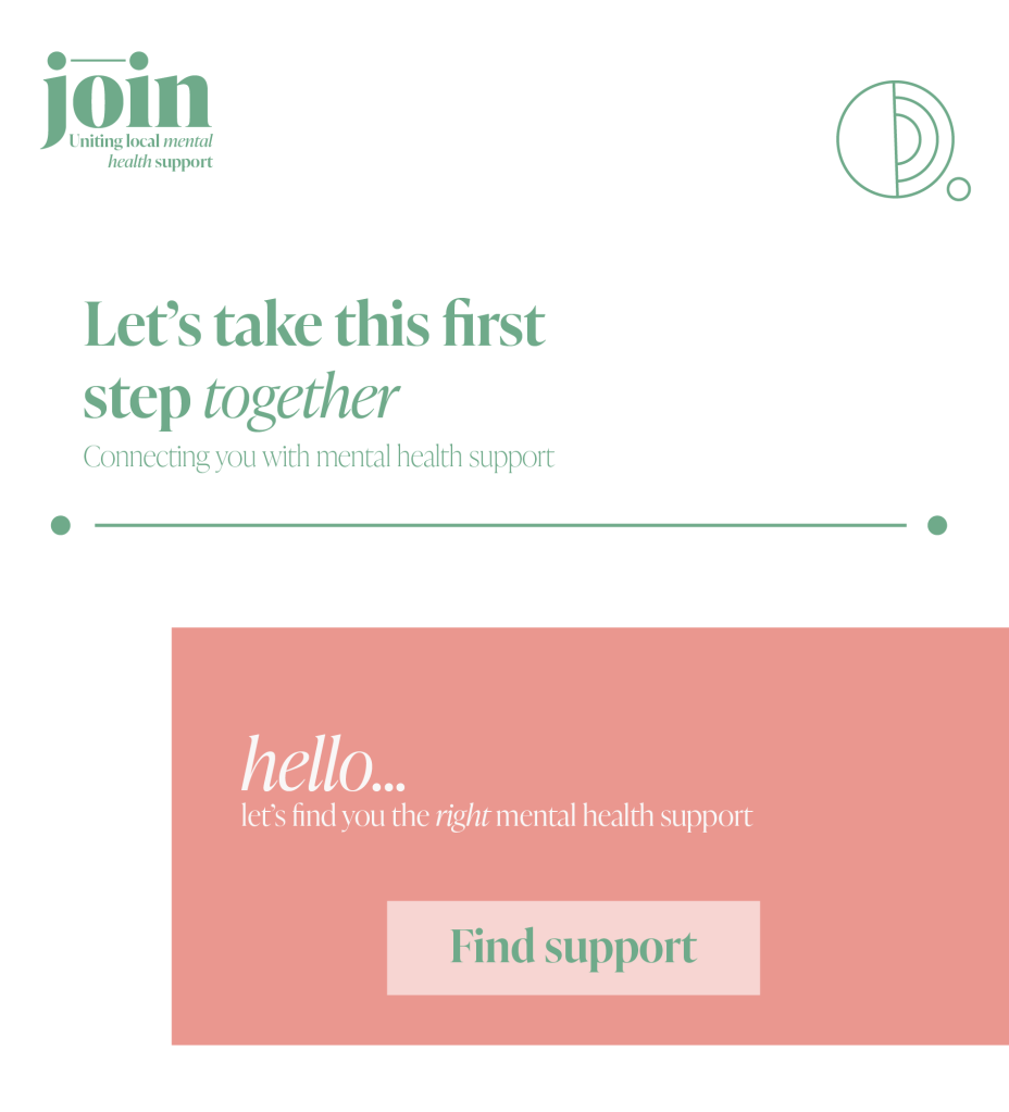
Therefore from the potential directions I explored last week, I have decided to take the website idea forwards. Despite being quite ordinary in comparison to the other ideas I explored, I think with my challenge in mind, it is the best way to deliver clear and useful advice to people struggling with their mental health. Anything more exploratory could be very powerful in raising awareness of mental health struggles, but I want to use design as a communication and clarification tool. It is the lack of design in many common mental health websites that are what cause them to be complicated and overwhelming. So I want to use design thinking and clarity to make accessing local, free mental health support easier.
For my project to be successful I want it to be as if someone is greeting you as you enter the website and saying don’t worry, we can do this together, let me show you what support is available and explain it to you. It needs to feel super welcoming and calming. It needs to lead you through the process and give you a potential solution at the end. I want it to feel easy and positive throughout, allowing the most overwhelmed user to find their way through easily.
As I am creating a very simple and calming website experience I want to be sure that my website doesn’t appear boring and unappealing to visitors. I read an interesting blog that featured tips on how to create interest on a website while keeping things minimalist and calm. They mention use of imagery and blog typography. (Media Template 2021)
Visual research
I had a look at some similar websites for inspiration.


I also looked at a range of app designs, as even though I am making a website, I want it to be easy to use on a phone.


Colour
I think the use of colour in my design is very important as it can have such an effect of peoples emotions.
“There’s a common idea out there that some colors are inherently positive or negative. Most often, warm colors (yellow, red, and orange) are considered to be positive, while cool colors (blue, green, and purple) are considered to be negative.”(Chapman 2019)
But actually there are seemingly endless factors that can influence how a color is perceived and how it affects human behavior and thought. Cool colors are more likely than warm colors to be perceived as calm.
Green, particularly lighter and brighter versions, can be associated with life and positive energy. Green is easily processed by the human eye, and is therefore often used to create a sense of relaxation. It’s also strongly associated with money and luck. Grey is also associated with simplicity, and is often used by marketers to calm and soothe consumers.(Chapman 2019)
There are so many different opinions out there about colour and how it affects mood and emotion, there are no set rules for this and its strongly debated. I want my colour palette to be very relaxing and welcoming, so I decided to play around with some colours and colour combinations to work out what felt right.

Shape:
In an article published in Proceedings of the Royal Society B, they described several studies they did to show that pointier images indeed corresponded to more exciting or angry emotions, whereas smoother shapes are linked to calmer emotions such as “sad” or “peaceful”.(Amsen 2019)
I am not surprised by this finding. Circles seem like welcoming and calming shapes. Without sharp corners I think they are softer and safer. I also like the idea of soft blobby shapes, like a lava lamp, as this soft blobbed movement is very relaxing and calming.
They are also very reminiscent of nature, that is well known to have restorative and positive effect on mental health.
Curves by the same idea are going to be calmer than sharp corners. But maybe the contrast of these can be used to increase the feeling of one of them.
The curves, textures and sounds of a Japanese Garden create a calming effect in someone within them.

“It should be no surprise that a tranquil space such as a Japanese garden can evoke a feeling of peace and calm for the person experiencing it. However, research has actually proven this to be the case. A 2013 study, testing several different types of gardens including a Japanese tea garden, revealed that the tea garden evoked the greatest emotional responses from their audience. It was reported that it lowered their pulse rate and had a soothing effect on their mood shortly after visiting.” (Stedman 2020)
Taking care of a Zen garden means you will do the same repetitive actions like rake the sand or the gravel, designing waves or circles. – repetitive actions are a good way to calm the mind and concentrate on the present moment. (Toneatto 2021)
Zen gardens are based on three Japanese concepts:
- Kanso, simplicity. Zen garden consists of a few simple decorative elements combined to create beautiful landscapes.
- Fukinsei, asymmetrical balance. Half a circle, stones displayed not in a linear way. Fukinsei is the art of creating a relaxing layout without following a precise arrangement of the objects.
- Yugen, it can be translated with “a subtle grace,” “hidden beauty,” and “mysterious profundity.” A Zen garden isn’t just a garden. The position of the elements may hide a deeper meaning than mere aesthetic design.
(Toneatto 2021)
I want to take inspiration from the simplicity and beauty of Japanese design in my project. The relaxing and repetitive shapes created by raking sand or gravel are reminiscent of the Japanese garden feelings.
I explored these shapes and patterns to see what felt relaxing and welcoming to me and what parts I could take forwards into my project.


Typography
In a simple design i think typography can have a really powerful role to play. Work by the Brand Identity is a good example of this.

For inspiration on simple but powerful design, I had a look at Studio Makgills work. Not only their designs, but also their website is a great example of simple design and how beautiful it can be.


‘Simplicity enables businesses to cut through the chaos of this ever-changing world”
Studio Makgill
This sentiment from them is exactly what I am aiming for in my design. I need it to cut through the chaos of the modern world and provide a calm and simple space for people to take the first step towards accessing mental health support. (Studio Makgill 2021)
Their use of typefaces are important in their designs, bringing the identity of brands together and making them instantly recognisable despite their simplicity.
I looked into lots of different typefaces to see which ones encapsulated the mood I was trying to create and experimented with different names and logo designs.


UX Design
Empathy is an important principle of good UX design. Understanding the user, their feelings and needs. understanding and connection to your users’ needs and goals.(Browne 2021)
Wireframe website
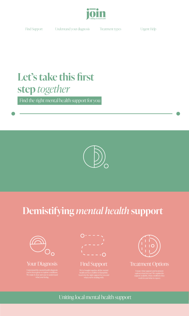
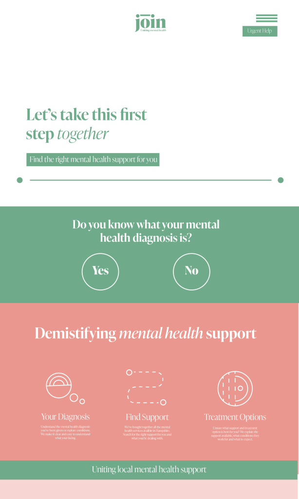
I started to look into how my website would be created. I want the user to find the support they need as quickly and easily as possible.
What do I need to find out to get someone suggestions of the most relevant support?
- I need to know where they live to find out what is near them, how old as some services are for children or over 18 etc. I need to have an idea of what they are struggling with and how severe.
- I need a list of all the services available and info about what happens there and who would best benefit from these things.
- I need to know what the up to date waiting time is for this service to give the user relevant information
- I need to be able to put the user in contact with the relevant service

Questions to ask
- Where do you live?
- How old are you?
- Do you know what mental health condition you are facing?
- [Yes] [I think so] [No]
- [List of conditions] [I’m not sure]
- Do you know what kind of support you’d like?
- [group] [one on one] [in person] [online] [self help]
- Over the last two weeks, how often have you been bothered by any of the following problems?
- Little interest or pleasure in doing things?
- Feeling down, depressed, or hopeless?
- Trouble falling or staying asleep, or sleeping too much?
- Feeling tired or having little energy?
- Poor appetite or overeating?
- Feeling bad about yourself – or that you are a failure or have let yourself or your family down?
- Trouble concentrating on things, such as reading the newspaper or watching television?
- Moving or speaking so slowly that other people could have noticed?
- Or the opposite – being so fidgety or restless that you have been moving around a lot more than usual?
- Thoughts that you would be better off dead, or of hurting yourself in some way?
- Feeling nervous, anxious or on edge?
- Not being able to stop or control worrying?
- Worrying too much about different things?
- Trouble relaxing?
- Being so restless that it is hard to sit still?
- Becoming easily annoyed or irritable?
- Feeling afraid as if something awful might happen?
How have you been feeling? Click all that apply
[worried] [scared] [stressed] [panicked] [lacking energy] [sad] [flat] [lonely] [hopeless]
Have you been doing any of the following?
[cancelling plans] [staying in more] [sleeping more] [sleeping less] [eating more] [eating less] [struggling to eat at all] [being unable to sit still] [getting annoyed easily] [missing work] [feeling compelled to touch, do or say certain things]
Have you felt any of these symptoms?
[difficulty catching your breath] [noticeably raised heartbeat] [upset stomach] [hearing voices] [intrusive thoughts] [
Further ideas
A idea came to me to help make this support feel more human. I could print some business cards that are subtly linked to mental health and point people towards the site. They could be left in public places and given to people to pass out to friends, family, colleagues or even strangers to point them towards the website if they need support.
Design development
From my research I came up with three potential design directions that my project could go in.
Japanese Garden Inspired

Friendly Welcoming Cartoon Character

Connection – Using a line

I sketched some potential ideas for how my website could look


From these drawings and my initial sketches last week I started looking at logo design and the name of my service. I started with the idea of a welcoming curvey name that could be given to the character I created.


I wasn’t sure about the name or look however so kept thinking on the idea of connection. In one of my sketches i wrote the word join and then added a line connecting the dot of the j and the i. I think this very simple idea actually worked really well, so i took this idea onto the computer to see what it looked like.

I then took these ideas onto my computer and come up with a few initial designs.


I like the friendly face of the character I designed last week, however i worry that it may come across patronising to some people. Also, although the blue is calming i think it is quite reminiscent of NHS services to me, which is something that I want to avoid if possible. I think the green and pink colour scheme is a bit more friendly and welcoming.

Reflection
After a lot of exploration, research and sketching I developed three possible visual directions this week. All still have a way to go and I think I will experiment with the connection and Japanese garden directions more as I move this project forwards. I like the friendly nature of the character i designed, but worry it may come across as patronising for some people and it doesn’t have the depth of the other two ideas.
As I want this website to be super simple, easy to use and welcoming, I think I need to play around with the layout and with white space to try and ensure my design doesn’t get too complicated. The ease of use needs to be at the forefront of my mind the whole way through. At the moment it seems quite crowded but lacking identity, so it definitely has a long way to go before it starts to look right. However, I am happy with the colours I’ve chosen as i think they give a nice relaxing vibe to the design.
Reference list
99U. 2019. “Joel Beckerman: Designing with Sound.” Vimeo [online]. Available at: https://vimeo.com/343057666 [accessed 21 Nov 2021].
AMSEN, Eva. 2019. “Why Some Shapes Make You Feel Calm and Other Shapes Seem Angry.” Forbes [online]. Available at: https://www.forbes.com/sites/evaamsen/2019/07/16/why-some-shapes-make-you-feel-calm-and-other-shapes-seem-angry/?sh=7c4ea67337ef [accessed 21 Nov 2021].
AWWWARDS. 2018. “Redefining Reality | Geoffrey Lillemon Creative Director of W+K’s Department of New Realities.” http://www.youtube.com [online]. Available at: https://www.youtube.com/watch?v=AUuTjsbNvpk&feature=emb_logo [accessed 21 Nov 2021].
BIERUT, Michael. 2015. How to Use Graphic Design to Sell Things, Explain Things, Make Things Look Better, Make People Laugh, Make People Cry, and (Every Once in a While) Change the World. New York, Ny: Harper Design, An Imprint Of Harpercollinspublishers.
BROWNE, Camren. 2021. “Here Are the Fundamentals of UX Design [Intro Guide].” careerfoundry.com [online]. Available at: https://careerfoundry.com/en/blog/ux-design/get-your-first-taste-of-ux-design-with-ux-fundamentals/ [accessed 21 Nov 2021].
CHAPMAN, Cameron. 2019. “Influence with Design – a Guide to Color and Emotions.” Toptal Design Blog [online]. Available at: https://www.toptal.com/designers/ux/colors-and-emotions.
GLUG. 2019. “Imagination Is Innovation | Google Creative Lab.” http://www.youtube.com [online]. Available at: https://www.youtube.com/watch?time_continue=1377&v=LdCBnqbCtm8&feature=emb_logo [accessed 21 Nov 2021].
KUNDARIYA, Harikrishna. 2020. “Top 10 Web Development Trends to Expect in 2021.” blog.hubspot.com [online]. Available at: https://blog.hubspot.com/website/web-development-trends.
MEDIA TEMPLATE. 2021. “How NOT to Bore Website Visitors When Using a Calmer Color Palette.” The Media Temple Blog [online]. Available at: https://mediatemple.net/blog/design-creative/calm-colors/ [accessed 21 Nov 2021].
STEDMAN, James. 2020. “How Do Japanese Gardens Stimulate the Mind?” thriveglobal.com [online]. Available at: https://thriveglobal.com/stories/how-do-japanese-gardens-stimulate-the-mind/ [accessed 21 Nov 2021].
STUDIO MAKGILL. 2021. “Studio Makgill — Beautifully Simple Thinking.” Studio Makgill [online]. Available at: https://www.studiomakgill.com/beautifullysimplethinking/.
TONEATTO, Alice. 2021. “5 Benefits of a Zen Garden That Will Improve Your Life.” Live Your Life On Purpose [online]. Available at: https://medium.com/live-your-life-on-purpose/5-benefits-of-a-zen-garden-that-will-improve-your-life-925f019fcbd1 [accessed 21 Nov 2021].

Leave a comment