Lecture notes
How do you respond to critical feedback and how is it delivered back to your team?
Torsten Posselt
Critical feedback is important, but it hurts on a personal level.
Have a chance to find out what’s not working in the project. Have to prepare yourself for all kinds of feedback, but critical feedback helps you to evolve. Don’t take it personally. You can normally turn it around into something better.
Matthew Jones
Integrated with clients in the way they work so critical feedback doesn’t happen so much when you iterate together. Feedback comes in little stages. Stops it from just being your point of view
Wouter Dirks
Feedback from client and also from public. Constant feedback from the client as they go along in the project, being honest can make the project better. ‘Feelings are facts’ still need to do something for any feeling from client if they are not happy even if they don’t understand it.
Feedback from public, people don’t like change – giving feedback online is very easy so they tend to ignore
Stijn Van de ven
Explain in the clients language why you’ve done what you’ve done with the design.
Luke Veerman
Take feedback to ensure you improve- need to get comfortable with negative feedback and not take things personally. Good to show work to people before it’s finished and get comfortable with that.
Lecture reflection
Negative feedback can be hard to take at times, when you have put time and effort into creating something. However, it is vital to be able to take feedback well and learn from it instead of taking it to heart. Luke Veerman believes that a good way to do this is to share your work often with others before it is finished. It will make you feel uncomfortable at first but getting comfortable with negative feedback is vital to help you grow and progress.
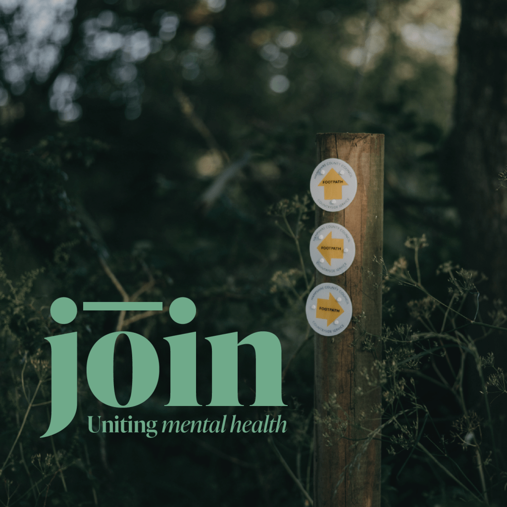
Design Development
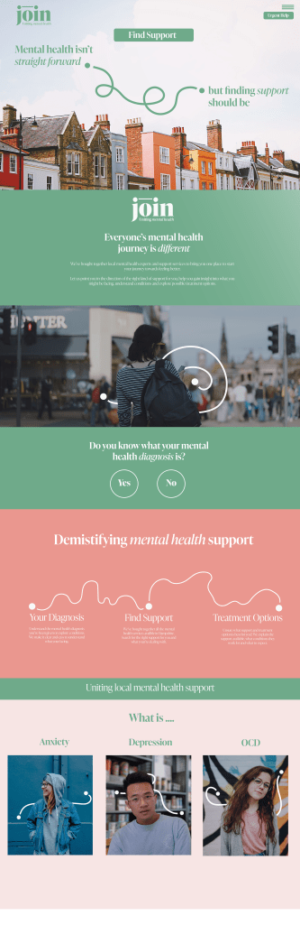
I started to develop my design further in line with the branding style I developed.
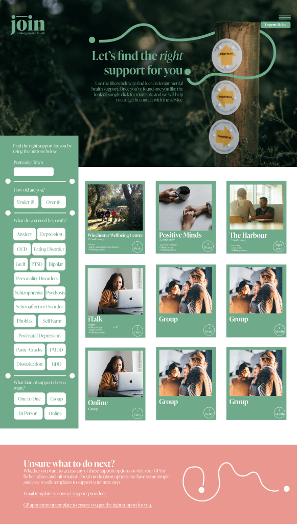
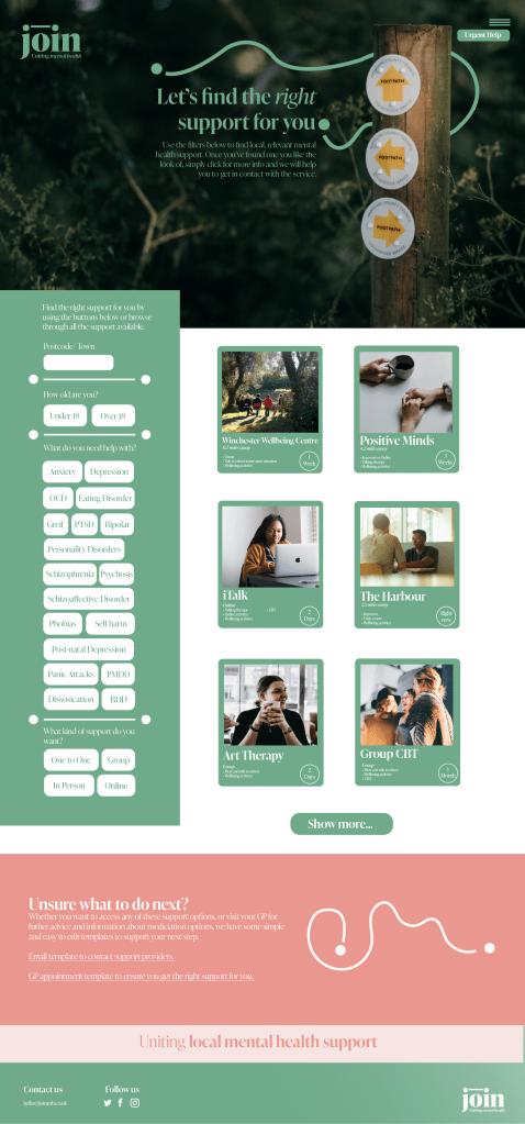
I created a page for filtering local, support options with a few clicks to find the closest and most relevant support for the user. I used large buttons in my design to try and make it as clear as possible for the user. Each service that comes up then has an image, a few points detailing what it is for, the distance away from the user its located and the estimated wait time for using the service.
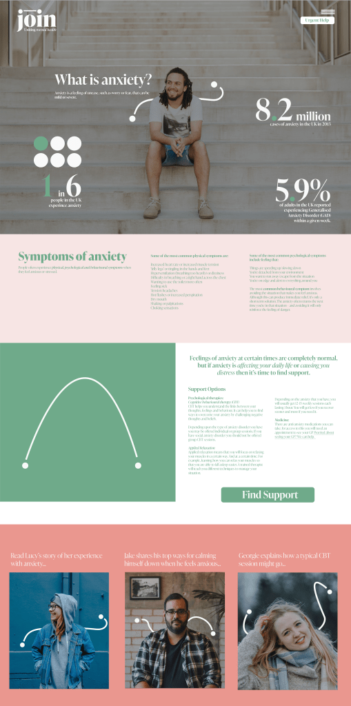
I also created an example page detailing a mental health condition, to also users to find out more about what they are struggling with, using bold statistics and clear information to show them that they are not alone.
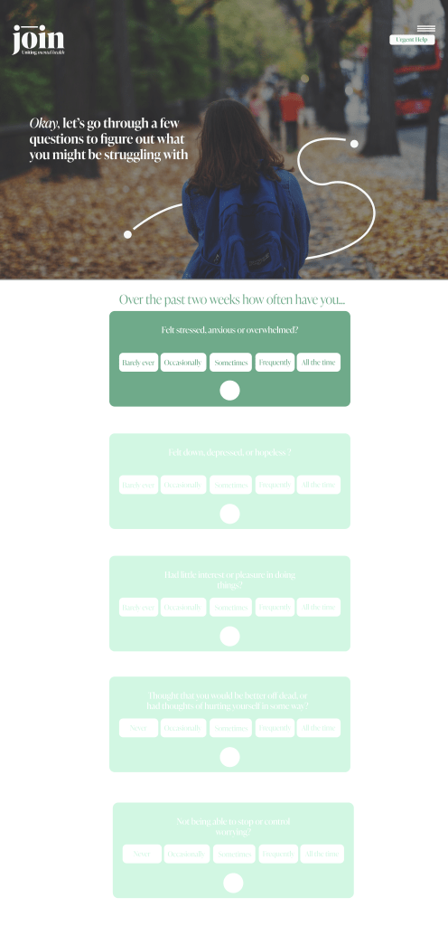
I then created a page to host my quiz that would allow users to get an insight into what they may be struggling with if they are unsure.
After a tutorial the feedback I received was that my project had grown too broad, and moved away from the original issue I had been trying to solve, which was how to help people easily find support local to them.
My design was trying to do too many different things within one space. I think the impact of this design will come from keeping it small and focused.
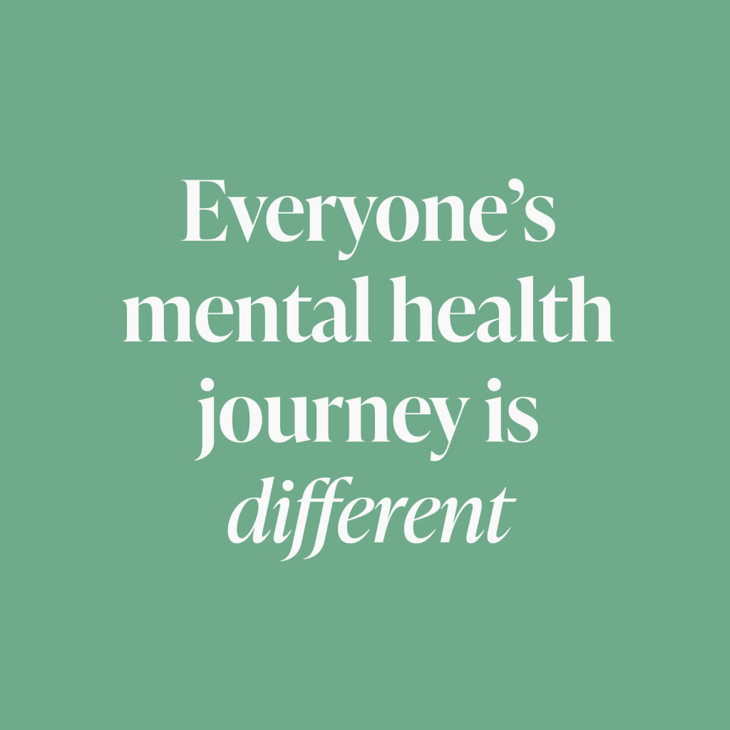
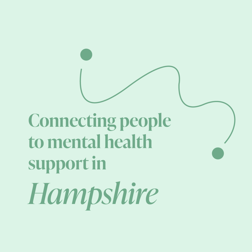
I decided to look back at my design under the focus of it being just for residents in Hampshire helping them to find local and human support. Making users feel like they are not alone and that support is close by.
I decided to remove the sections that give information about mental health conditions and the quiz that offers a possible diagnosis and instead work on improving the connection element.
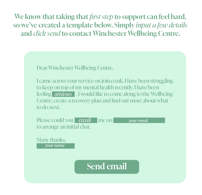
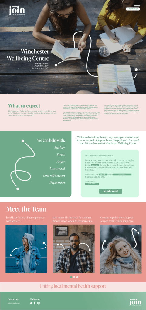
Instead, I created an example service page that the user would find when clicking on a particular local service. I added in a section to help users actually reach out to these services and take the step towards accessing support. Many people feel worried about admitting they are struggling and find it hard to form the words to talk about mental health. Therefore, I created a email template that users only have to enter in a few sections such as their preferred method of contact and contact details and press send for the message to be sent to the service.
To keep myself focused I paused to evaluate my progress and to make sure my design was solving a problem.
What makes my design different and needed?
Most websites available already offer confusing, sometimes clinical and text heavy advice. Its overwhelming. When pointing towards support they mostly offer links to entire service providers, whose websites are also often confusing and hard to navigate. This website will bring all the individual local services (not service providers) together into one, easy to navigate, clear and friendly website where users can quickly and easily locate relevant local support for them and then contact that service directly – all on one site and with support the whole way through.
With this in mind I kept refining and developing my design to create three webpages.
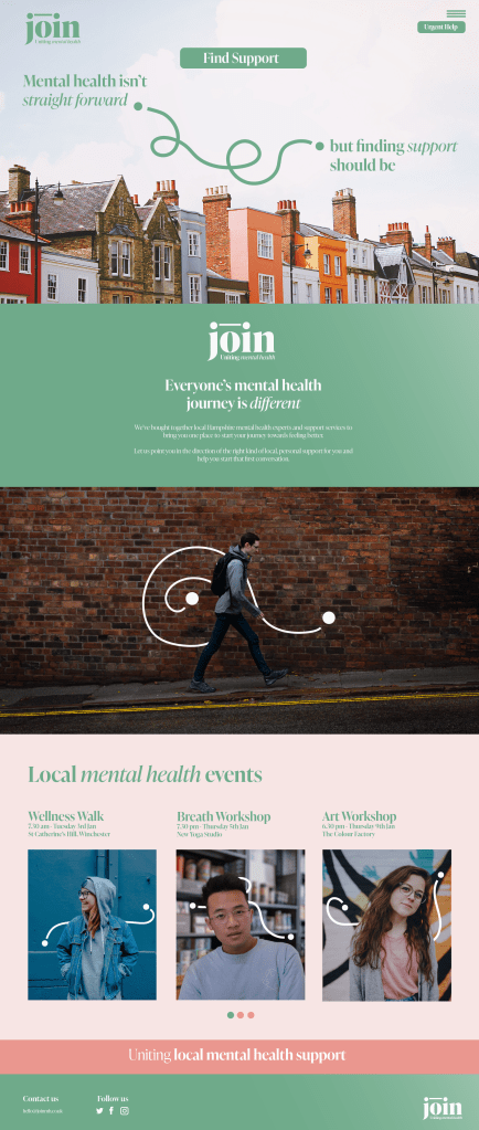
I adapted my homepage to make it mobile friendly as I think a lot of people will access this website on their mobiles.
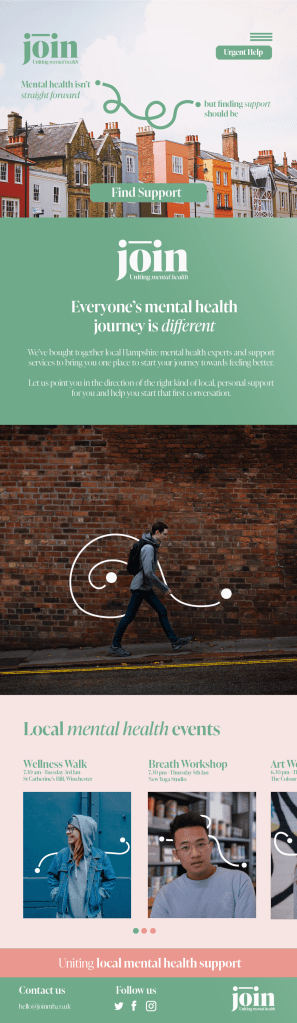
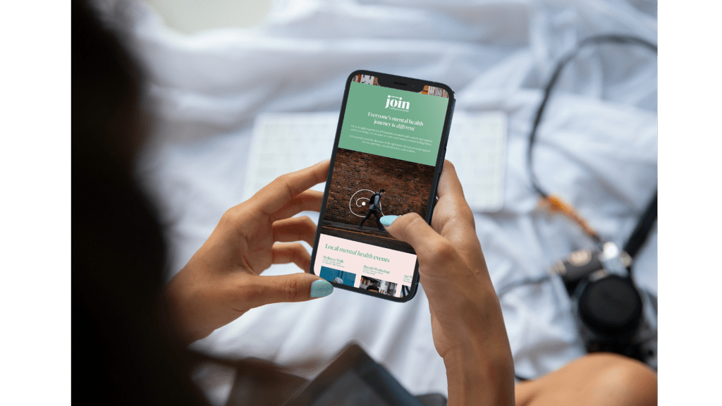
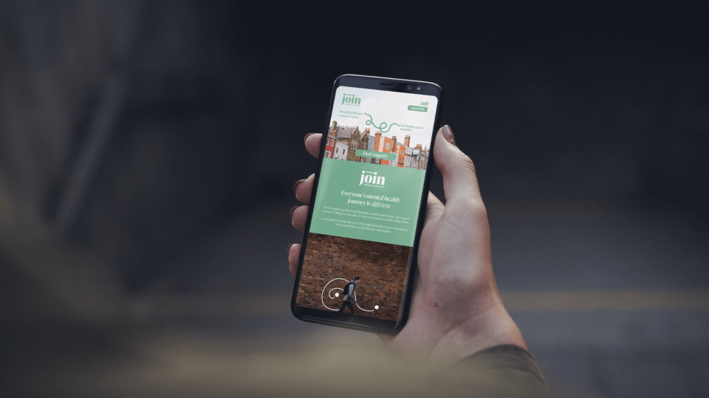
I then tried to make these into a simple prototype website using figma, to get a feel for how the website would feel to use in reality. See this prototype here:
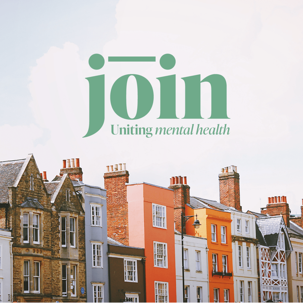
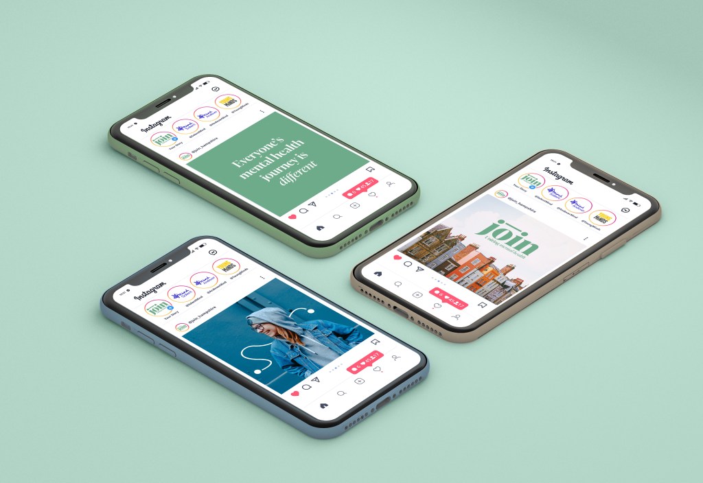
I then started to develop some social media graphics and posters that would be used to raise awareness of the website around Hampshire.
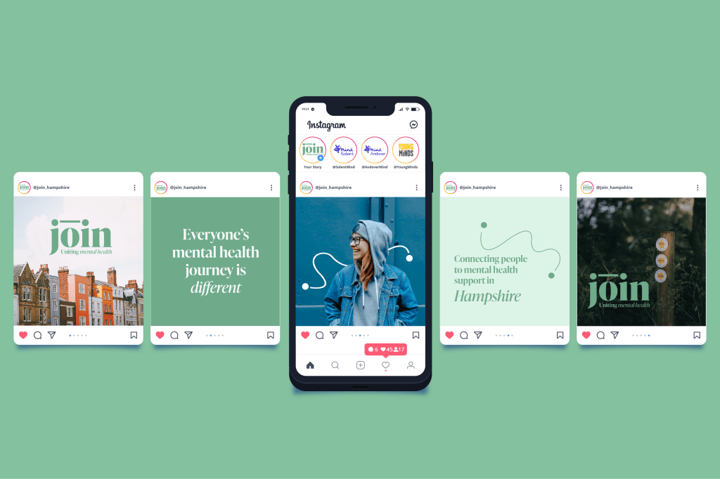
The feedback I gained from the crit was that my website was looking very calming and attractive. That my idea was one that would be really valuable but that I need to consider how I would get people to be aware of my service.
Therefore I decided to think of some additional ways of spreading the word and reaching all kinds of people in the local area.
I created a concertina card that people would be able to give out to friends, family, colleagues or strangers to help them if they were in need of support. It would point them towards the website.
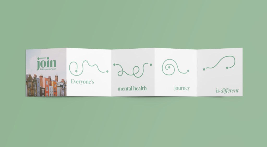
I like this idea of having something small and friendly that could be passed on to others as a way of offering support and showing you care when you are unsure what to say or do. However, I am not sure this design is exactly right for that.
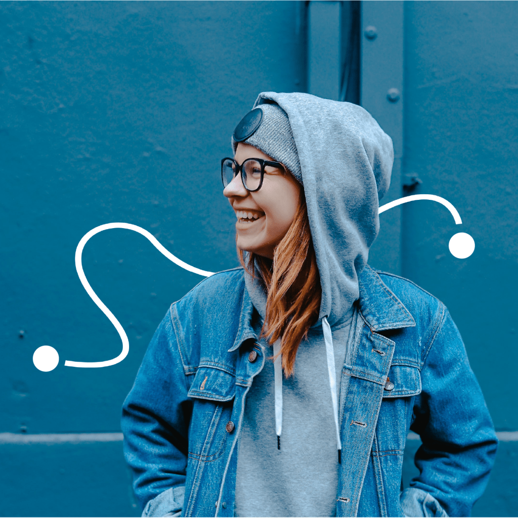
I want something that is relaxing as an object but also directs people towards support. Maybe you can repeatedly draw your own line (or representative mental health journey) between two dots over and over again as a meditative and relaxing act. This would also be reminiscent of raking circles in a Japanese garden which was one of the starting points for my idea so it would be nice to bring the design back round to this somehow.
These lines created could also be uploaded to the site and create a work of art that shows the mental health journey of people in Hampshire.
I sketched some potential ideas.

I looked at cards you can pass out to people, flyers, posters, floor stickers leading the user to an iPad showing the website, a small game where you try to connect the line with support information on the back.
As my service is relativity localised, I would use print advertising such as posters in public places and flyers in doctors surgeries to spread the message of my service. I want these to be eye-catching, welcoming but also informative so people are able to easily understand what the service is.
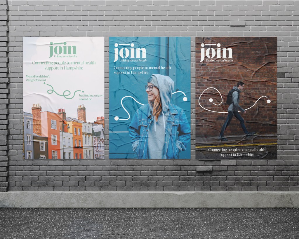
I used the idea of different lines representing different peoples journeys, and created a simple logo animation to show this. This animation could also be used within any video based promotion of the website I created and on social media. I would like to create an animation, based on the idea of the connection line to explain the website in a really clear and engaging way. This could be then displayed in doctors surgeries, other public places and on social media.
Reflection and Next Steps
I am happy with where my project is currently in terms of idea and branding. I have created three webpages, which I think show clearly the idea and design of the website, however I would like to create a few more designs to promote the website such as another card option and a flyer.

Leave a comment