Lecture Notes
How does project evaluation help you and your client / audience measure effectiveness of your final outcome?
Torsten Posselt – Good to sit down with your team and even the client to evaluate the project. What worked and what didn’t. You often have a clearer view of the project afterwards. Can sometimes find a better way to explain it after you’ve left the project. It’s good to evaluate before you present the project.
Matthew Jones- Different clients look for different success metrics. For him repeat business is how they evaluate if the project was a success or not as it can often be quite unmeasurable.
Wouter Dirks -Evaluate with whole project team. Personal talk and an anonymous email. Some are evaluated with consumers.
Stijn van de ven -Can be hard with branding projects as they take along time to be realised. Evaluating makes the next projects easier.
Luke veerman -What was the brief and what have you delivered. Written agreement from the client that it’s fine to deviate or make sure you are answering the brief properly.
Lecture analysis
Designers reflect on their work in different ways, but they all seems to value it as an important activity for future growth and improvement. I think the way you evaluate the success of a project differs from project to project, but is a step that should never be overlooked.
Final development
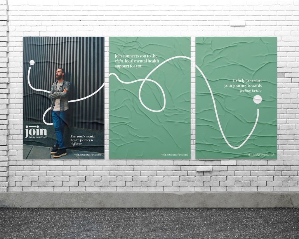
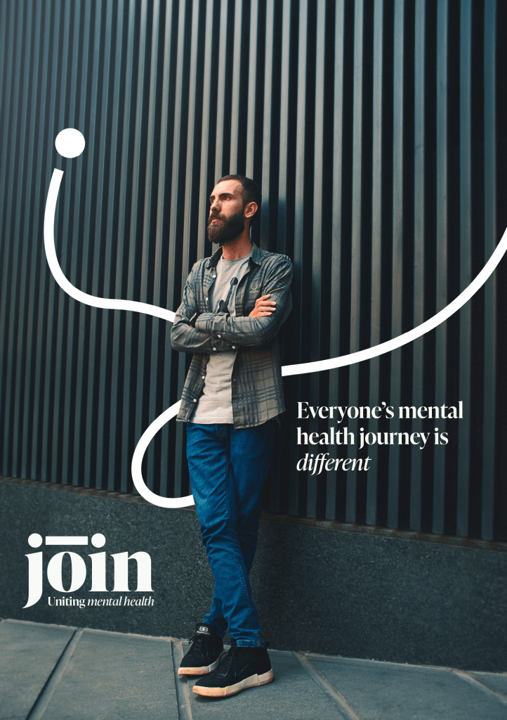
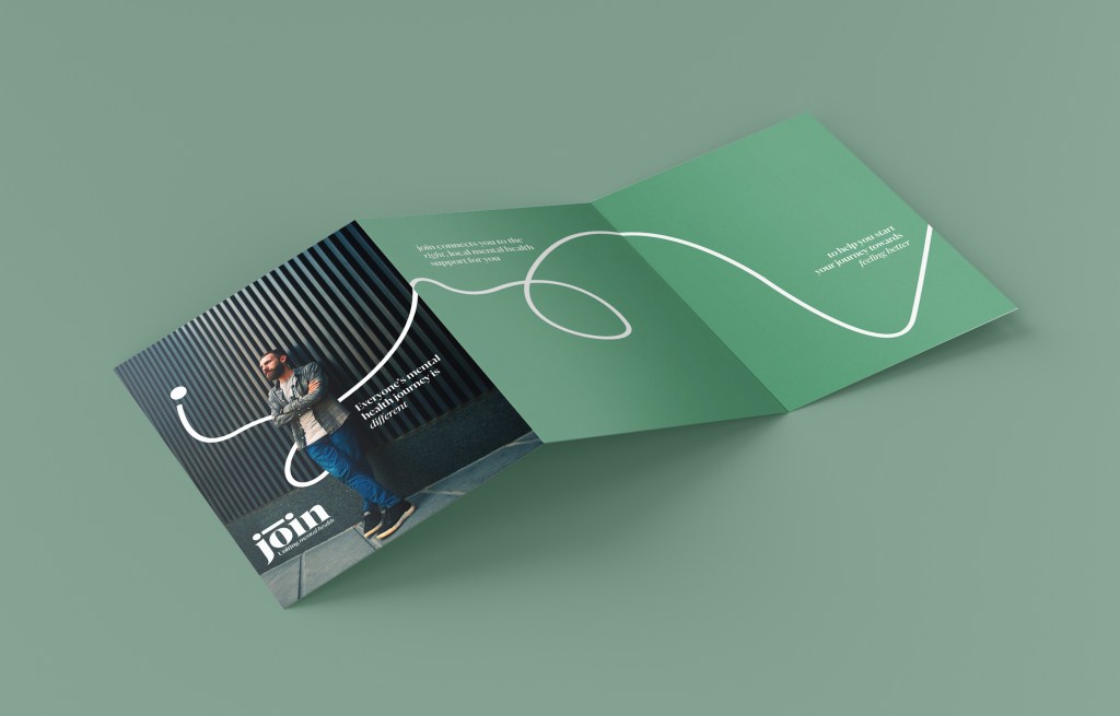
I decided that to ensure that my advertising had impact, I would make the posters and flyers I created bolder than the website itself, but still within keeping of the brand. I want the website experience to be calming and simple, but the posters can be more attention grabbing and bold.
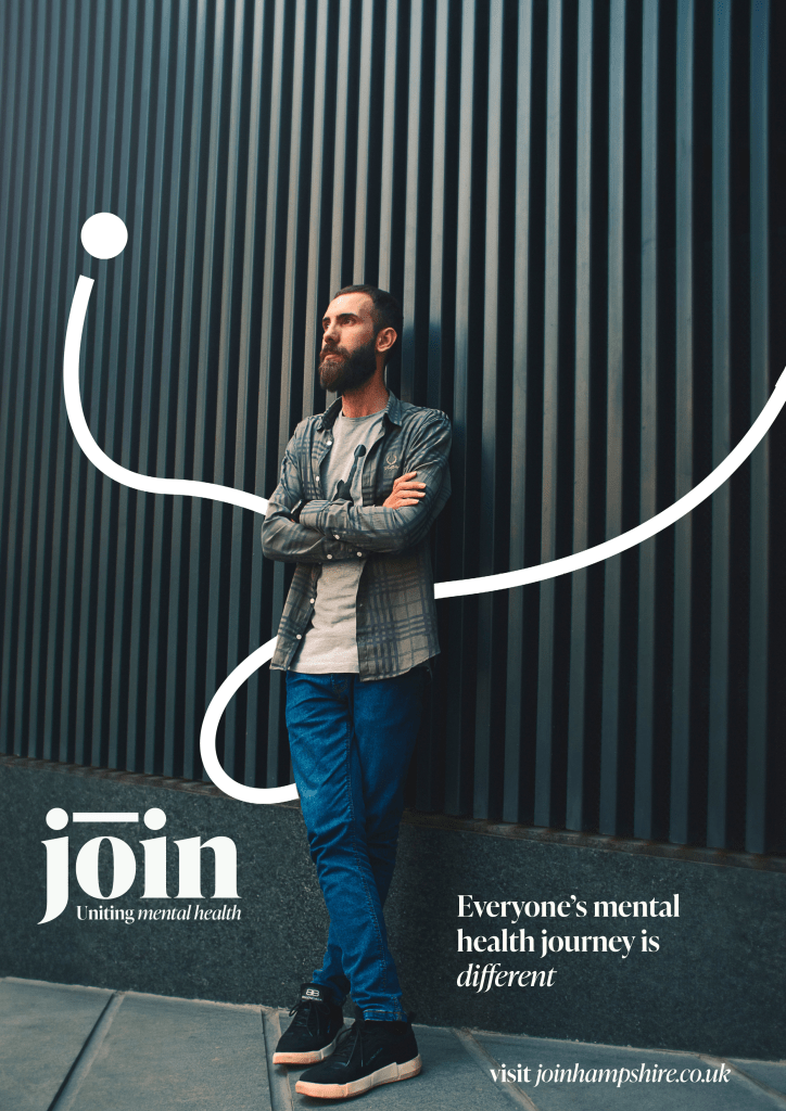
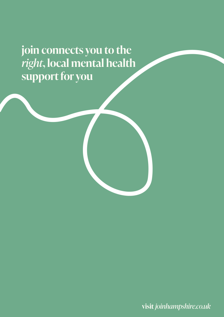
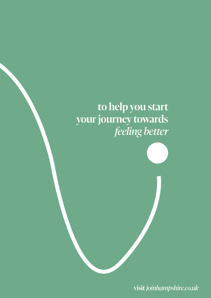
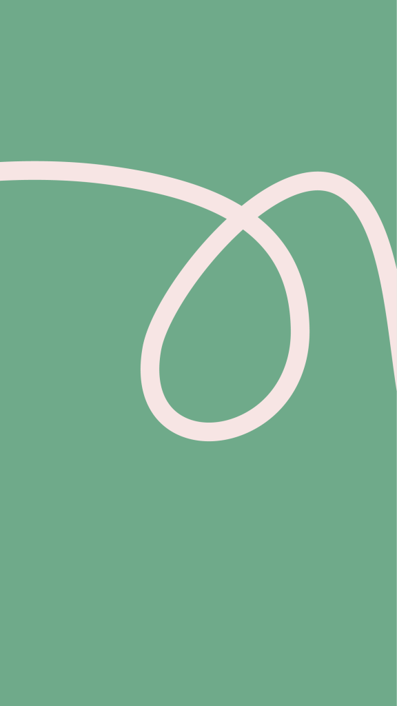
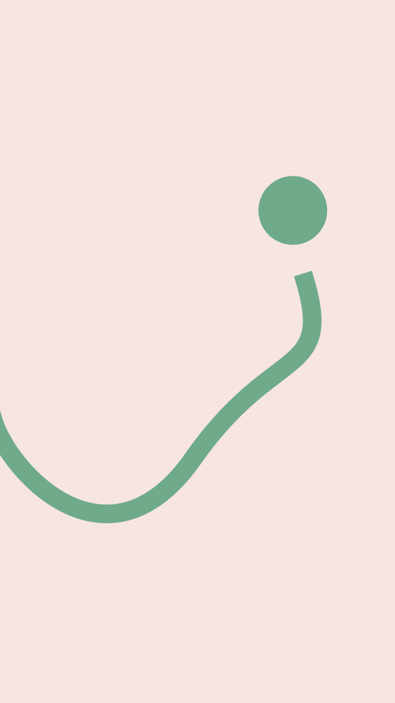
I created this effect, while keeping the design in the brand style, by making the line thicker and larger so it continues off the page.
From the sketches I made last week, I created some small ‘business card’ sized cards that can be passed out to people who my be struggling or left in public places to signpost people towards the website


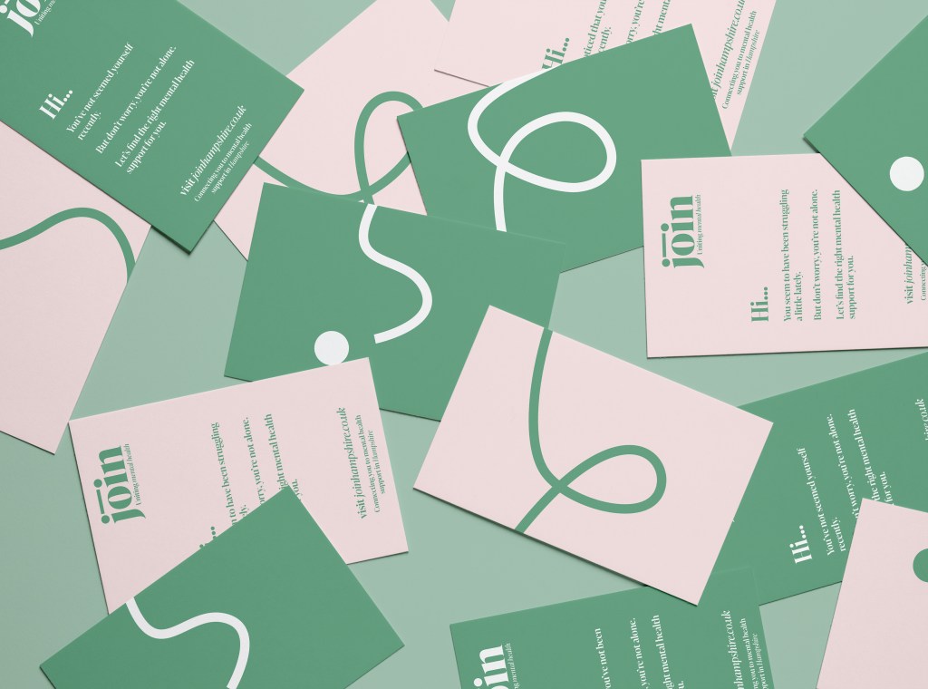
I also created a flyer that would be placed in libraries, doctors surgeries etc. or used as a direct mailer to reach people who were more home bound.


I like this idea of having something small and friendly that could be passed on to others as a way of offering support and showing you care when you are unsure what to say or do. However, I am not sure that the business card designs ive made so far are exactly right for that.
I want something that is relaxing as an object but also directs people towards support. Maybe you can repeatedly draw your own line (or representative mental health journey) between two dots over and over again as a meditative and relaxing act. This would also be reminiscent of raking circles in a Japanese garden which was one of the starting points for my idea so it would be nice to bring the design back round to this somehow.
A potential way of doing this could be using a digital card that can be sent to people either in a message, email or airdrop. On the digital card you could create your own line and be linked to the website.
These lines created could also be uploaded to the site and create a work of art that shows the mental health journey of people in Hampshire.
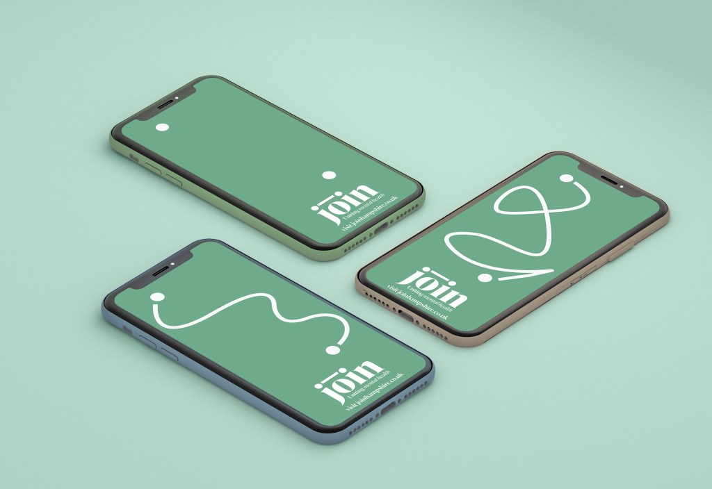
I created a simple mockup to show how this idea could potentially look.
Feedback
I could tweak and develop my design a lot further but in the interests of finishing on time, I sent my project out for feedback to people from mental health charity Solent Mind, a GP and potential mental health service users.
“Your images are all of young people – I don’t see myself represented there and might think it’s not for me, just young people. I found the white writing on the pink background quite hard to read.
You could say that many people think that they need to go through their GP to be referred to services/help and that this is not always true – people can self-refer. Do you need to have something that makes it very clear that people that really do need to contact their GP or hospital will understand that they need to do that (or will the services that they self-access do that for them maybe?)”
Potential Service User
“really simple, sleek, great colours and easy to read.”
Mental health professional
“I think it is great and the layout and design is very appealing, attractive and positive. I think there is very much a need for this which helps people to navigate in an intuitive way.”
Local gp
“I like the content and the way it flows. I like the easy text and the connectivity. It looks good on the phone and computer displays and I could imagine it appealing to young people especially, who would not know how to access help”
Potential Service User
“The design is very approachable, I’ve struggled previously to navigate information to access the help I was looking for. This website points me where I need to go in a simple and straight forward manner.”
Potential Service User
I spoke to Tom who works with Solent Mind as a wellbeing trainer and is also a freelance wellbeing coach.
“I think the idea is brilliant and the website has a really lovely feel. It’s very welcoming and calming, unlike many of the text heavy websites out there that can feel very overwhelming for people who are feeling worried or anxious.”
He told me that he thought the idea had developed into something really good and useful. Initially he had been worried that it was a replication of other websites, but believed my outcome to be different and useful.
In his experience of talking to service users they often ‘get lost online’ and find the experience of looking for support very overwhelming. He thinks my website has a ‘lovely feel’, the text choice, images and colours are very welcoming and calming. He thought the line, ‘mental health isn’t straight forwards, but finding support should be’ is very good wording for the situation.
The simple wording and design was good to stop people from feeling confused or overwhelmed.
He thought the ideas of introducing staff from the services and offering a email template to contact were particularly good ideas as from his experience that first contact was often the hardest for people.
Tom recommended adding in a ‘I don’t know’ button onto the filtering support page as an option for those who were unsure what support they needed. This could be linked to information about next steps, for example contacting GP as well as general well-being support services.
He also recommended adding in the term wellbeing alongside mental health, as some people find the wording ‘mental health’ to be off-putting and well-being can be seen as more acceptable to some who don’t think they are ‘ill enough’.
He was glad I moved away from the idea of a quiz to aid diagnosis as he thought that it could become risky to offer a potential diagnosis to people online.
Evaluation
I started writing notes about how my project went and what I thought of my outcome.
What went well
I like the look of my finished website and additional designs. I think its is friendly, calming and welcoming. I have also received feedback saying the same thing.
I think it has achieved my goal of creating a simple way for people to find local support. I also think it has the effect of making the user feel more like a person than a number which is another goal I had.
I managed to get feedback from people who work within mental health and a GP, who all said the idea was needed and the design was welcoming and attractive.
I also think my brand has developed a good identity and would be easily recognisable.
What didn’t go well
It is a shame that I couldn’t make a prototype website to try out the user experience during the time frame.
I would have also liked to create this while working closely with people who are or have struggled with their mental health. I think their input would have been really valuable all the way through the project.
I also think the page design is a bit static and I would have liked to continue working on it to make them a bit more dynamic.
I would have liked to come up with a really powerful idea for sharing the site using small cards that people pass around, but I didn’t have time to fully realise this idea and find a solution I was happy with. I hoped to find a calming and meditative ‘token’ that people could pass on to those who needed it but this was not fully realised unfortunately.
I also received feedback that it felt very aimed at the younger generation, so I think I should have ensured the photography I used was more representative of a variety of age groups.
Quick summary of my project
When you’re struggling with your mental health, deciding to reach out for support can feel hard and scary. When you try to find support and the process is confusing, overwhelming, embarrassing or impersonal it can easily put you off accessing the support you need.
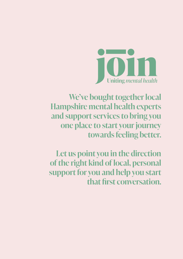
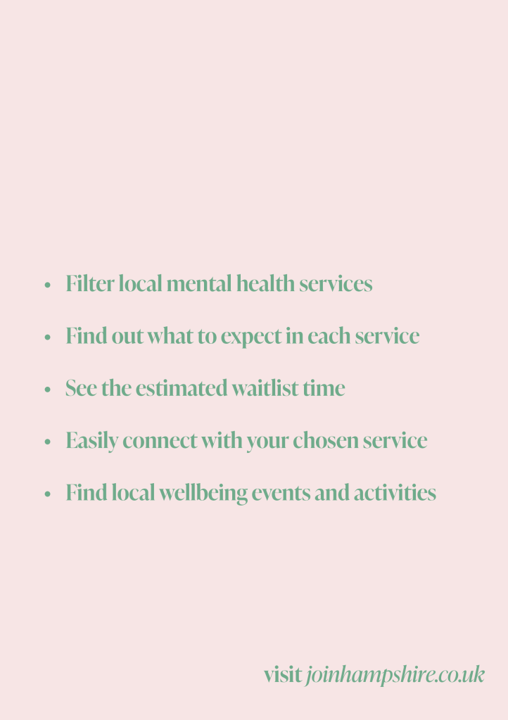
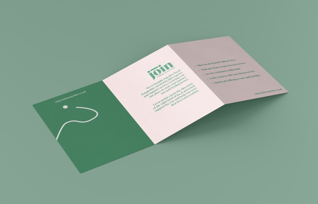
Join is a website to help connect people in Hampshire to local mental health support in an easy and friendly way which is not overwhelming, clinical or impersonal. It shows the real people behind the services, helps people make that integral first contact and builds a supportive local community to help improve mental health.
Why did I choose this project?
I chose this project question as having working for a local mental health charity I saw first hand how hard it can be to find support and how many local services were not being fully utilised. Accessing mental health support can be confusing and overwhelming and it really shouldn’t be, I wanted one place where people can come to find support and start their journey towards feeling better.
My key aims at the start of this project were to:
Create something simple, engaging and user-focused
Make it easier for someone to take the first step towards getting help
Create an accessible outcome
Did I achieve them?
I think my website is simple, engaging and user focused and makes it easy for someone to take the first step to accessing support. However I think I would need some further development to make it more accessible to everyone with additional features such as voice control, adjustable type size and the ability to change the language.
Evaluating each stage
Concept
When setting my idea I tried to focus in on a small part of the brief and focus on something that I had a personal interest in and a connection to. I think this was successful and coming back to the question kept me focused through the project.
Research
Speaking to people who have tried to access mental health support previously was really valuable and helped to form the basis of my project. However, I would have liked to keep his connection going and re-engage with these people throughout my project to allow them to help shape the whole idea. This wasn’t possible however within the time frame and around other work commitments.
Learning from my last project, I tried to research a broad variety of influences, which I think really helped me to come up with new and different ideas and gave me a great base of resources to pull from when I felt I was lacking inspiration.
Development
After finding staying within my notebook to be really useful in the last project, I made sure to sketch as much as possible in the development phase to help my ideas flow freely. This allowed me to come to both my logo design and my branding style.
I took onboard some feedback during my development stage that my idea was straying too far away from my original question and becoming too broad. After I reframed my designs and bought them back inline with my original question I think they began to become much more impactful and successful.
Deliver
I aimed to push my design as much as possible and developed the branding into marketing materials. I think these were bold and eyecathing, while still in keeping with the brand. I liked how I was able to push the line used in my design out of the frame of the page when I needed it to have more impact and keep it housed within the page when I needed the branding to be more reserved and relaxing.
Next steps
My next steps with this project would be to create more webpages from these original designs and make them into a website prototype to give to potential users to get their opinion on its usability and what further changes are needed.
I would also like to reach out to local mental health services formally to find out if they would want to get involved and have their services on the website.
I would create more ways of sharing the website, including an animation or video that explains the service and draws people in. I would have liked to come up with a really powerful idea for sharing the site using small cards that people pass around, but I didn’t have time to fully realise this idea and find a solution I was happy with. I had hoped to create a calming and meditative ‘token’ that people could pass on to those who needed it.
I would also develop the accessibility of the website to ensure it was welcoming and useable for all. I think the page designs are a bit static and I would have liked to continue working on them to make them a bit more dynamic.
Feedback
I sent my project out for feedback to people from mental health charity Solent Mind, a GP and potential mental health service users.
Overall the feedback was positive, people thought the look of the website was very welcoming, calm and user friendly. They also thought the idea was good and the website would be very useful for many people and much nicer to use than the confusing text heavy options that are prevalent currently.
I received feedback that the design seemed very focused on the younger generation, and that I needed some more information available for people who were unsure what they needed support with. I would have liked to adapt my design further with these in mind but unfortunately didn’t have enough time.
Overall
Overall I am happy with the design I created. I think that having a clear, user friendly website to bring together all of Hampshire’s mental health support would be incredibly useful for people to help with their mental health journey.
I like the look of my finished website and additional designs. I think its is friendly, calming and welcoming. The feedback I received was mainly positive about the idea and the look of the website.
I think there is more I could do to make my design better and develop it further, but within the timescale I am mostly happy with what ive created I think it has achieved my goal of creating a simple way for people to find local support and that my brand has developed a good identity and would be easily recognisable.
I turned this evaluation into slides and a presentation video to reflect on my project, Watch it here.

Leave a comment